


A few months ago, I wanted to have both text-shadow and linear-gradient applied to a h1 on my then very, very basic personal website. All the website was, was a single page of the name of the website centered on the screen.
Thats it.
I first went with the super flat look that is now falling out of style (with us now returning to some amount of skeuomorphism), though I quickly realized how boring the super flat look now is or can be if done poorly. And mine was done poorly.
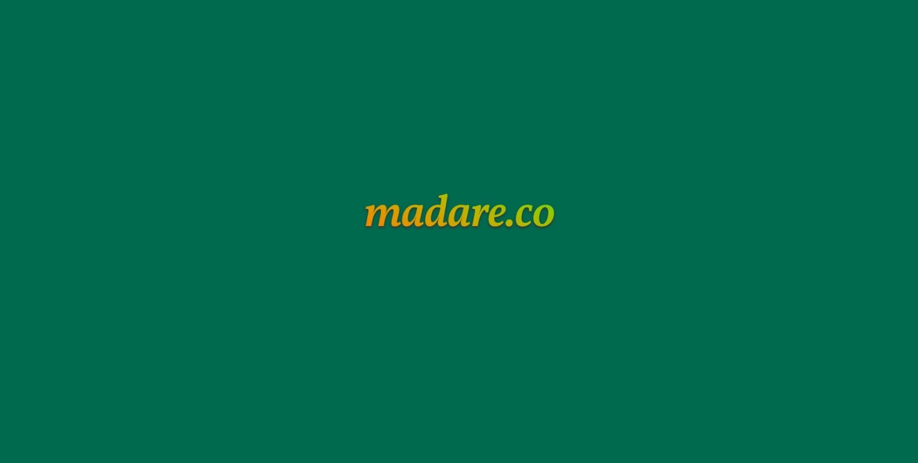
So, I added a very subtle shadow but that wasn't enough. My vision was not complete. I wanted some additional things happening. Why not a gradient? Imagine an orange-yellow-lime gradient text on a "pool table green" background. This was my color palette at the time.
Unfortunately, I could not figure out how to have both text-shadow and linear-gradient applied simultaneously. Though a decent amount of searching I found an article from more than 10 [!!] years ago now.
Sharing the love here, because who knows how long the above article will still be available on the internet?
Note: The article does not mention this, but I found that I had to change the display property of the h1 to inline-block to get the desired effect to work.
The Solution (tl;dr)
Create the
h1in your HTMLStyle it in your CSS with
linear-gradientandbackground-clip, etc.Create a
h1::afterpseudo class in your CSSStyle that with
text-shadow, etc.
Result
HTML
<h1 data-text="madare.co">madare.co</h1>
CSS
h1 {
    font-style: italic;
    font-size: 600%;
    letter-spacing: -2px;
    display: inline-block;
    background: linear-gradient(to right top,
        #ff6f00,
        #e89100,
        #c5af00,
        #95c800,
        #44de23);
    background-clip: text;
    -webkit-background-clip: text;
    -moz-background-clip: text;
    -moz-text-fill-color: transparent;
    -webkit-text-fill-color: transparent;
    position: relative;
}

h1:after {
    background: none;
    content: attr(data-text);
    left: 0;
    top: 0;
    z-index: -1;
    position: absolute;
    text-shadow: 0 3px 5px #333;
}